Sunday, September 30, 2012

September 30: Tokyo Drifter/Tôkyô nagaremono (1966 -- Seijun Suzuki)

★★★★

Life imitates art.  The last film I saw by Suzuki, Take Aim at the Police Van, was in black-and-white and ended in a train yard.  Tokyo Drifter starts in a train yard in black-and-white, focuses on a single red gun, and then shifts into the full-blown color it’s famous for.  It’s as though a director were managing my film watching.

However, that director wouldn’t be Suzuki because such a transition would be far too fluid.  One of the style flourishes that stands out here --  and in Suzuki’s work in general, I think – is the jump cutting that makes a viewer work to figure how to get from scene A to scene B.  The first attack on Tetsu after he leaves Tokyo is typical of the abrupt cutting.  We see a gang attacking the hideout, we see Tetsu fighting them, we see him walking in snow whistling, we see the face-off with Viper on the track and then we’re back in Tetsu’s hotel where he’s having his wound tended to.  Figuring out how one of those scenes leads to the other is quite a task.  In other places, I nearly missed who shot the girlfriend/secretary, I still don’t know what happened with the attempted kidnapping, and I’m not sure why the car is destroyed in the junkyard.  Tokyo Drifter isn’t afraid to rush forward while challenging you to keep up.  Changes in camera angles challenge, too, like the sudden cut to overhead views when Tetsu is trapped in a pit and when the secretary is shot.  Or the noir-ish low-angle shot of the business meeting.  In another scene, we see Tetsu talking while leaning over a desk with some vague chair detail in the background.  After he talks awhile, he stands up and turns around, continuing to talk.  You do a double-take and see that he’s been pensively leaning on the desk and that the person he’s been talking to all along is, in fact, behind him.  There is a lot of such creative editing and camera work here, all the more surprising given how pre-MTV this film is.

Character development in the film is analogous to story development.  We see Tetsu assume a series of poses and attitudes, but we don’t see how he gets from one to the other.  Tetsu is in love, then he isn’t; loyalty suddenly looms large in the plot.  Just like we get two different scenes and must figure out the connection, we get a series of character attitudes and have to fill in the psychological blanks.

If, in fact, filling in the blanks is at all a concern here.  Tokyo Drifter could accurately be described as a series of ecstatic scenes put together with some exposition.  Suzuki gives us one strikingly-colored composition after another.  The hero wears his robin’s egg blue suit and white shoes throughout, and we’re treated to a series of brilliant sets in yellow, red and pink.  The bar is yellow, the meeting room fuchsia, and the office of building owner is decorated with classical imagery.  The final showdown occurs on an classically-inspired, abstract, white theater set with a large, oval sculpture that changes color as the action proceeds.  Tokyo Drifter is a series of such striking, abstract images.

The abstraction in the film is wonderful.  The highlight is the shootout at the conclusion.  By the time we finally get to this point, the film has even given up trying to create rooms.  We have some stairs that don’t go anywhere, a column that doesn’t support anything, a door with no room behind it and the color-changing abstract sculpture.  These are simply theatrically-lit stage props, and the action here is similarly stylized with something close to dance choreography.  I can hardly imagine what a B-film audience would have thought of this movie if they’d come in expecting a gangster flic. 

Or perhaps a Western.  Tokyo Drifter has many echoes of the Western.  Obvious links are ones like the name of the saloon – Western Saloon – and the typical brawl that erupts in it.  But Tetsu himself is also a Western hero, a tough guy who’s a good fighter.  In this character and others, Tokyo Drifter addresses the Western concern with defining masculinity.  Like in many Western films, the tougher a character is, the more masculine he is, and when Tetsu resists fighting, he’s seen as weak.  He earns his masculinity and the attendant respect by fighting.  Just as the film is concerned with honor, Tokyo Drifter comes to focus on loyalty.  Tetsu's character arc is from being a loyal protector of his boss to renouncing loyalty and becoming a wandering drifter, reminiscent of both the wandering samurai of other Japanese films and the Western hero.  The women here are from a Western, too, accessories to the men.  While we may root for Chiharu to win her man as she pursues him, we know that the real Western hero’s life is just going to be too hard for a woman.

Tokyo Drifter is thoroughly enjoyable, and it has distinctive links to films that followed it.  Although it’s easy to see Tarantino’s abstract violence (Kill Bill) and Jarmush’s stylization and color (Mystery Train), even films like Coppola’s One from the Heart and Scorcese’s New York, New York have some affiliation.  And it’s hard not to think of Jean-Jacques Beineix’s colors and abstraction in Diva, which also includes Asian gangsters and a character with a musical fixation.  Suzuki’s Tokyo Drifter even provides some small context for Ohbayashi’s later, incredibly creative House.


Saturday, September 29, 2012

September 29: A Scandal in Paris/Thieves' Holiday (1946 -- Douglas Sirk)

★★★

A Scandal in Paris doesn’t quite gel the way Sirk’s later Hollywood melodramas would, and it’s not quite as playful as its contemporary Lubitsch comedies, but there are a few elements of both in it.  There’s an artful deftness in Eugéne Vidocq that has the attraction of some of Lubitsch’s villians: the guys are bad, but you can’t help having at least a little sympathy with them.  And when it comes down to it, they aren’t completely bad.  Also, the film has the structure of sophisticated comedy with complex plot turns and surprises like the Vidocq’s evolution from criminal to police chief and his discovery that an old conquest is now married to the police chief he ousted and looking to restart her relationship with Vidocq.

And there’s melodrama here, too, that would become Sirk’s trademark.  After a formulaic first two-thirds, A Scandal in Paris does a sudden shift in tone from witty crime to melodrama.  In a particularly compelling scene, former police chief Richet disguises himself as a bird seller and, while spying on his wife, discovers that she is planning to cheat on him with Vidocq.  An intense argument ensues with both speakers being as cutting and hysterical as they can while the bird chirping on the soundtrack gets louder and louder.  The scene peaks with Richet shooting Loretta in a fit of rage, the bird sounds declining, and the hapless man being led off to jail by the very man who wrongly ousted him from his post.  This type of over-the-top melodrama is what I expect from Sirk.  And I ‘m not surprised at the ending of the film either, as Vidocq confesses his sins, gets absolution from the minister, and marries the girl.

A Scandal in Paris is not what I would call vintage Sirk, but there are plenty of elements to engage.  And you don't' have to look hard to see where Sirk is going.

Friday, September 28, 2012

September 28: The Furies (1950 -- Anthony Mann)

★★★

If Douglas Sirk had made Westerns, they would’ve been a lot like Anthony Mann’s The Furies.  With the melodrama, female-focus, intense psychology, ornate interiors and love of reflection, I could easily have thought this film was Sirk work of the 50s.  And I enjoyed the film for the same reasons I like that part of Sirk’s career.

The melodrama is intense.  A powerful woman, Vance takes whatever she wants, so when she is used by Rip to get at her father, she not only fails to get the man, she’s used as a tool to hurt her beloved father.  And her melodramatic response to that episode governs much of the rest of the picture.  We get the same intensity when her father, TC Jeffords, breaks his word and hangs her life-long friend Juan, who has just saved her.  And again when her father brings a sophisticated city woman to the ranch and decides to marry her and give her the ranch.  Emotions are at pitch point through this entire film.

The Furies also has a psychological intensity throughout, centered on Vance.  As the masculine name suggests, there’s a struggle at the heart of the Barbara Stanwyck character, one in which her male qualities of wanting power and authority – mostly to replace her father – conflict with something close to desire for her father.  In the opening scene, we find her in her deceased mother’s room trying on one of her mother’s dresses.  We also see her cracking her father’s back and often closely face-to-face with him.  And then there’s the competitive tension between Vance and  TC’s future wife, which culminates in a physical attack on the soon-to-be new wife.  It’s hard not to see an Electra complex at work in Vance, but there’s also some amount of gender confusion.  After Juan has been hanged, the daughter and father face off with a tall, penis-shaped cactus silhouetted in the background.  This is the beginning of their final struggle for power.

In addition to the psychology, power and gender issues are at the center of this film.  TC Jeffords is a charismatic sociopath who has built an empire that stretches as far as the eye can see, and Vance’s abiding obsession is to wrest it from him.  In The Furies, she realizes her quest for power, even choosing to ignore her father’s last wish.  Her other power struggle is with Rip, who repeatedly puts her in her subordinate place only to have her rebel and push back.  Her heart might love, but Vance has a drive for power that her heart won’t stymie.

In fact, women’s power is an important subtext throughout The Furies.  Not only is the Vance/TC struggle at the center of the film, but every time we encounter women in the film, their primary function is develop the idea of women’s power.  Wife-to-be Flo explains to Vance the importance of being lady-like but wielding power, and she demonstrates her master of that skill by wrapping the giant TC around her finger.  The wife of the bank president in San Francisco plays a similar role.  When Vance goes to San Francisco to ensure that the bank president renews TC’s mortgage, Vance ignores the man’s advances and goes directly to his wife, correctly assuming that she wields the real power in the bank.  The two women play to each other, using the hapless male as their pawn.  And of course there’s the ending of the film where TC has not only been swindled out of his empire by a woman but is then shot dead by another.  The West of The Furies is not like the West we typically encounter in film.

The film develops all these ideas in beautiful, effective cinematography.  Panoramic, John Ford landscapes create the larger context for the drama, but Mann brings his unique touch with the interiors.  Rich as a Sirk set, ornate rooms here are decorated with unique objects that carry significance, like the three-horn lamp on TC’s desk.  And the characters move through the sets with halo lighting bringing the actors out from the background and sparkling off bright highlights and mirrors, which themselves often show what’s happening elsewhere in the room.  Carrying over from his recent previous work, Mann also introduces some noir camera into his Western.  At one point, we view an angry, frustrated Vance through the screen of a heavy banister, and we also see her from below as she casts a large, menacing shadow.  A round-up scene later in the film features a series of close-ups of cow hands, creating suspense as TC decides to wrestle the symbolic, rogue bull.  The landscapes may owe a debt to Ford, but these noir-ish elements are Mann’s.

There are certainly problems with this film.  The tone shifts abruptly, character growth is sometimes unmotivated, and the story logic isn’t always clear.  But even with these problems, The Furies is one of the more unique Westerns I’ve seen.

Wednesday, September 26, 2012

September 26: Jean Painlevé III -- Eight Films Scored by Yo La Tengo


★★★
For this Painlevé evening, Lou and I looked over some stills by Painlevé and watched a musical suite by the experimental rock group Yo La Tengo to accompany eight Painlevé films.

I didn’t cull much from the stills that I hadn’t already noticed in the films.  Painlevé has a photographer’s eye, and his stills have the same sensibility as his films, only with a more control.  He’s able to manage framing and focus better when he doesn’t have to keep his subjects at the right place in the frame and in the right light.  But it’s the same aesthetic in both.

As for Yo La Tengo's new music, Lou and I agreed that there were some worthwhile ideas in the performance even if the music isn’t riveting.  I think the soundtrack to Cristaux liquids is one of the most interesting, with its waves of sonic noise reflecting what we are seeing on screen.  The electric guitar chords for Les amours de la pieuvre are a good choice, too.  Harmonically, I like the dreamy sound in the beautiful Hyas et sténorinques that’s cut with an occasional dissonant burst, a sound analog to the sudden, awkward leg movements of the film’s subjects.  Similarly, the frenetic rhythm in Histoires de Crevettes echoes the manic leg movements of the shrimp.

But my biggest pleasure in watching this Criterion DVD feature was rewatching the films themselves.  Percussionist Georgia Hubley points out in the interview in the DVD set that Yo La Tengo generally found a theme or musical idea for each film and worked with that throughout each film.  I heard and enjoyed that theme.  But it was the beauty of Painlevé’s images and the fascinating content that kept me at my screen.  And Lou and I both also like the period taste that guided Painlevé’s original musical choices anyway.

Tuesday, September 25, 2012

September 25: Jean Painlevé II -- Popular Films (Part 2)


Lou and I continued our PainlevéFest with a couple of longer articles and the rest of what Criterion calls his “Popular Films.”

The first article, “Contradictory Forces” by Brigitte Berg, is a biography, and it fleshes out many of the generalizations we saw in the first set of readings.  Painlevé was an indifferent student who didn’t care for education by lecture -- a bias that would incline him to use film for teaching, I’d think – and he had an appreciation for the sea and for cinema from an early age.  He and life partner Geneviève Hamon were deeply involved with contemporary cinema and left-wing political causes, though they didn’t officially join any movements.  I was particularly interested in Painlevé’s close association with Jean Vigo.  Berg describes Painlevé’s involvement with the development of scuba equipment, so it makes sense not only that Painlevé would go on to work with underwater photography but that Vigo, too, would have underwater scenes in Taris as well as L’Atalante.  It was part of the gestalt of the era.  Starting in the immediate prewar period, though, Berg’s biography loses steam.  She lists a series of organizations that Painlevé tried to create or served in, but there’s not a lot of insight into Painlevé’s work in that detail.  This organizational involvement recalls Painlevé’s father’s political career and shows the filmmaker as something of a renaissance man.

The shorter essay, Ralph Rugoff’s “Fluid Mechanics,” was a fun read that took me back to graduate school while putting a finger on an important aspect of Painlevé’s work: how it can make a viewer feel vaguely uncomfortable.  Rugoff uses Freud’s description of the uncanny as his pretext.  If Freud says the uncanny is the normal made strange, then we can see Painlevé as making human seem eerie.  Shrimp experience tragedy in Painlevé, but they have several kinds of strange legs that make mechanical movements.  Acera dance to attract attention, but they’re hermaphroditic, breed in clusters and look like monsters.  Seahorses struggle for dignity, but the males bear the children.  Rugoff sees Painlevé as making anthropomorphic observations about animals, but unlike Disney's familiarizing the unfamiliar, Painlevé’s anthropomorphism leads us to question the very things we think of as human.  It’s an interesting take on Painlevé’s work and identifies the element of disturbance that I sense in many Painlevé films.  I don’t completely accept Rugoff’s concluding opposition of Western culture/stasis/knowledge to nature/movement/knowledge, but there’s no denying Painlevé’s work is full of motion.  Les amours de la pieuvre particularly comes to mind.  But rather than a critique of Western epistemology, perhaps Painlevé recognized that movement is key to a movie.

★★★★★ The Vampire (Le Vampire), 1945 – Postwar Allied aesthetics didn’t have a lot of good to say about the Germans, and this film fits that context well.  Germans were seen as corrupt, perverse, and distorted in postwar cinema, and Le Vampire clearly links these qualities to Germany.  Nature, the film says at the beginning, has its monstrosities, and the parasitic creature at the center of the film hobbles like a cripple and lives on the blood of its vital victims.  If the German Expressionist titles and the images of Nosferatu weren’t enough to establish the Teutonic quality of the bat, the famous salute toward the end of the film would clinch the deal.  As the bat nibbles on the nose of guinea pig to start a flow of blood, I found myself cringing.  Rugoff would say that my discomfort comes from facing the human in metaphorical form and recognizing its unnaturalness, recognizing that such perversion is part of humanity.  To the soundtrack of Duke Ellington’s “Echoes of the Jungle.”  

★★★★★ Freshwater Assassins (Les Assassins d’eau douce), 1947 – Les Assassins looks like another response to the human brutality the Second World War had unleashed.  Here we see organic perversions like breathing organs at the rear of an animal while its jaw is an actual part of its digestive system.  Brutality abounds in this world though there are flashes of the humanity we know – a vulnerable worm bleeds as it’s consumed, a mollusk “sings” at its escape.  At the same time, the predatory creatures themselves can even get locked into fights to the death with each other, sometimes ganging up on a single victim.  The humanity we see here, Rugoff would point out, is disquieting if not terrible.  And again, to a driving jazz score.

★★★ Sea Ballerinas (Les Danseuses de la mer), 1956 – With its intellectual score, Les Danseuses draws a parallel between contemporary dance and the beauty of natural motion. 

★★★★ Diatoms (Diatomées), 1968 – It must have been in the air in 1968 because, with their abstract visuals and electronic sound, the early parts of Diatomées look and sound like parts of the ending of Kubrick’s contemporary 2001Diatomées then goes on into Brakhage territory with its abstract beauty and fans of diatoms.  The film is a real delight of cinematic sound and imagery. 

★★★ Pigeons in the Square (Les Pigeons du square), 1982 – As Berg points out, even on his deathbed, Painlevé was making film.  While Les Pigeons is not the master at the height of his game, Painlevé’s last film hews true to his belief that film can teach and popularize science.  He takes the completely banal animal of a pigeon and demonstrates how much we can learn about it merely by looking at it discerningly.  This last Painlevé film almost redeems the animals for me.  


Monday, September 24, 2012

September 24: Shame (2011 -- Steve McQueen)


★★★★★

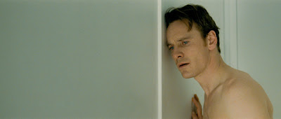
After this film and his debut, Hunger, Steve McQueen is near the top of my list as one of the most interesting people working in film today.  He has a fine art background and shows in museums and galleries around the world, and he bring this sensibility to feature films.  Shame has a rich visual quality that engages in every scene, often in a unique way.  At one point here, Brandon goes for a late night run, and the camera tracks alongside him for blocks in real time, the rhythm of Michael Fassbender’s strides communicating the character’s intensity in coping with his situation while the blue-tinged streetscape passes along beside him.  McQueen favors long takes.  Several of the sex scenes go on uncomfortably long, and we linger on Fassbender’s pensive, sculptural face in several places, drawn into the character and trying to think along with him.  Similarly, Brandon’s dinner with Marianne is a series of long takes, the opening one the most impressive.  After Brandon arrives late, the camera watches like an anthropologist as the two diners exchange greetings and the server comes to the table to deliver the welcome, menu rundown, and questions we experience every time any of us goes out to eat.  Here, the real-time, available light prise de vue creates an analytic feeling to the scene, asking us to study all the familiars for signs of significance.  And after the many long, deliberate takes and rigorously linear storytelling, McQueen approaches the end of Shame with a series of shorter, non-linear flashbacks anchored in a visit to bar and a beaten Brandon on a train.  And even these two temporal anchors are fragmented and presented out of order.  Not only is this segment of the film more elegantly edited than a David Fincher flourish, but the form echoes the fracturing of Brandon’s monolithic, impassive psychology.  This section of the film is tour de force of cinematic beauty.

Like in Hunger, though, McQueen goes beyond the visual beauty of fine art cinema to create a fascinating, complex character.  Fassbender’s Brandon engages no one in the film, neither at work, with family, nor socially.  Psychologically sealed off from human contact, he is obsessed with sex either with strangers he meets in bars or the subway, alone in frequent masturbatory sessions, or on line with pornography or paid service sites.  Sensual jolt is the only feeling that gets through Brandon’s wall. As portrayed by Fassbender, Brandon’s isolation has a fierceness that borders on frightening. 

Such psychological intensity could only be countered by an equal intensity, and Brandon’s sister Sissy brings that into his life.  Carey Mulligan’s Sissy Is the opposite of Brandon to the extent that she wants involvement with others rather than rejects it, but he matches him in her intensity.  She needs, even craves, interaction with others every bit as much as Brandon rejects it.  We hear her begging her boyfriend to take her back, and we watch as she allows Brandon’s sleazy boss David to pick her up for a fast moment of fun.  We soon find that that she’s cut her arms many times, a gesture calling for attention.  Her demand and his rejection make an oddly necessary sibling pairing in Shame.

We see a couple of clues that the psychological intensity of the two has its base in some early experience.  Sissy’s rendition of "New York, New York" has an intensity that suggests lived experience, and Brandon’s tear on hearing it shows the intensity of his response. Both had clearly wanted to leave where they were to head to the bright, saving lights of New York.  We also hear a phone message that Sissy leaves Brandon that says, “We’re not bad people.  We just come from a bad place.”  Both are intensely damaged individuals, and it clearly takes Sissy to break through Brandon’s repressions.

Ironically enough, the only character in Shame to whom I’d apply the label is David, Brandon’s boss.  This is a man who is perfectly willing to pick up an employee’s sister for a one-night stand, have sex in the employee's apartment, and the next morning complain about pornography on the employee’s computer while chatting online with his child about his wife.  The damaged Brandon and Sissy may not act in an acceptable fashion, but they clearly have a major psychological trauma in their background.  It’s the hypocritical husband and father who should feel shame.

Shame is a unique, tremendously affecting portrait of a man who has been damaged and turns to sex as a substitute for the human contact he can't experience.  For that achievement alone, this film is worthwhile.

Wednesday, September 19, 2012

September 19: Tiny Furniture (2010 --Lena Dunham)

★★★

Tiny Furniture is yet another interesting indie film.  Its bright, sharp cinematography won’t let you break away from the visuals, and the film is strong on that level alone.  Lena Dunham puts her Aura before the camera continually, and just as continually violates conventional images of women in movies.  Aura is heavy, she has blemishes, and she doesn’t dress in an elegant or even flattering way.  In fact, she’s sometimes just wearing quotidian undergarments.  She’s quite a contrast to the 2001-like apartment of her mother, the whiteness of which makes objects float on the screen,  the natural beauty of her sister Nadine and the glamor of her drug-rattled friend, Charlotte.  Dunham’s cinematic close-up aesthetic gives all of this a striking intimacy.

This intimacy complements the portrait of a woman that Tiny Furniture develops.  Aura is transitioning from college to life, but she finds she has little to no guidance or support.  Men don’t help: Jed is more interested in staying at her mother’s apartment than in having a relationship with Aura, and Keith is more interested in having sex than a relationship.  Aura and her sister lack intimacy, and Aura’s mother is cold and narcissistic.  Only Charlotte is willing to extend a helping hand to Aura, and Charlotte’s is not a direction Aura should go.

Tiny Furniture doesn’t have traditional storyline.  Things happen sequentially, but nobody and nothing grows, builds or changes in the film.  Instead, Dunham creates a striking portrait of a girl, in all her real femininity, who needs to make a transition.  The theme and cinematography work hand-in-hand to evoke this particular moment in a particular character’s life.  It’s the authenticity of Tiny Furniture that makes it so vivid and so worthwhile.

Sunday, September 16, 2012

September 16: Jean Painlevé I -- Popular Films (Part 1)

Lou and I decided we’d do our own survey of shorts by Jean Painlevé.  We’re combining the films from the Criterion, three-DVD set called Science is Fiction: 23 Films by Jean Painlevé with readings from the Bellows and McDougall collection of essays called Science is Fiction: The Films of Jean Painlevé

The first set of essays we read—including Scott MacDonald’s in the DVD booklet—mostly make the point that film genres as we know them today hadn’t solidified when Painlevé began with film.  Added to that openness was the hugely experimental period that Painlevé began his filmmaking in--the 20s and 30s--and the fact that that he was very involved in contemporary aesthetics and leftist political activity.  The result of all these factors is that Painlevé’s films combine elements that we expect to find distinct in today’s film world.  His science movies have artistic elements and elements of his personal taste along with their scientific content.  Marina McDougall uses the word "hybridize" to describe describe Painlevé's assimilative working style.  The essays also stress that Painlevé wanted to use film to popularize science, although scientists of the pre-War era didn't embrace that idea.  

The Bellows and McDougall anthology has photograms of many of the short films, often with a comment by Painlevé.  It's not clear to me whether Painlevé himself did these photograms or whether the editors did.  Whichever, they're nice to have.

And these first eight films are impressive.

★★★★ Hyas and Stenorhynchus (Hyas et sténorinques), 1927 -- An early film in the set, there are moments of real beauty here.  All the characteristics in the readings are clear.  Although Hyas is grounded in science as the film explains the crabs decorate themselves with local flora, Painlevé's myriad associations quickly personalize this scientific content as the narrator compares his subjects to fashion, arm wrestling and Japanese warriors.  With the Chopin soundtrack in the background, aesthetic considerations quickly come into play with the back- and side-lit worm plums.  Then the film concludes with an impressive fireworks show, biological but narratively impressive, too.

★★★ Sea Urchins (Oursins), 1954 -- This is one of my favorites of the evening.  The biology here is interesting since there is so much variation in the types of stems coming out of an urchin.  And Painlevé again characterizes his organism with reference to other, familiar objects like Greek columns and jaws.  In his description, the urchin becomes a community rather than an individual organism as he describes the collaborations of the various types of spines in creating a whole.  His choice of music underlines this communal theme.  Early on, we hear the soundtrack to an experimental film with electronic noise, but the visual rhythm of the stems is soon joined by a samba.  As the film ends, layers of rhythms stack up, suggesting the communities of parts at work in the urchin, ending with some overall rhythm coming out of the actions of all these communities working together.  The urchin is a metaphor for a leftist understanding of society.

★★★ How Some Jellyfish are Born (Comment naissent des méduses), 1960 -- Not my favorite film but still interesting.  In the biology of various jellyfish, we again see individuals absorbed into community.  What looks like a plant is actually a collection of jellyfish working together.  Biology and ideology work together again in this science documentary.

★★★★ Liquid Crystals (Cristaux liquides),1978 -- Lou and I both went to Stan Brakhage to find a way to respond to this abstract film.  Colors and shapes shift throughout this film in a ways suggestive of a kaleidoscope, but the forms of this shifting lack the symmetry you would expect.  The shapes and colors morph into other shapes and colors, all the while a modern score plays in the background.  And it's science.  This is a deeply satisfying, seven-minute short, unique in the films Lou and I watched tonight.

★★★★ The Sea Horse (L’Hippocampe), 1933 -- Rightly one of the most praised of Painlevé's films, the witty and sympathetic L’Hippocampe presents the sea  horse with great dignity.  Providing ample biology, Painlevé describes the sea  horse as an enlightened liberal, the male taking upon himself most of the burden of childbirth and equalizing gender roles in doing so.  An ideal with its origin in views of the Left.   L’Hippocampe concludes with some wit, the seahorse in the foreground wtih a steeplechase back projected.

★★★★ The Love Life of the Octopus (Les amours de la pieuvre), 1967 -- This is my favorite film of the evening. Its electronic soundtrack in the background, the film starts with a dramatic narration as we watch an ocopus crawling through shallow water.  The drama is laced with biological information about the animal's eyes, beak, skin and behavior.  When the film turns to mating, the dramatic tone gives a cinematic reason for the male's behavior in arching his fertile tentacle delicately over to the female while staying safely away.  My favorite part of the film is the section dealing with the maturing of the eggs as we see rapid cellular tortion within the egg before the embryo is fully formed and a constant spinning motion ensues later that suggests the sltihering behavior of the adults we've seen so much of by that point.  These simple, silhoutte images with the soundtrack feel like a dada gesture thirty years after the movement's heyday, as does the shift to black at the end as the soundtrack continues for some few seconds.  This film joins science and aesthetics seamlessly.

★★★ Shrimp Stories (Histoires de Crevettes), 1964 --  Histoires de Crevettes has an unpromising start with some of the silly Franco humor that the Anglo world makes fun of.  There's even a bad reference to the Marx Brothers.  But as the film moves below the waterline and we learn of the biology of these creatures, comedy yeilds to drama and we find out about the functions of the various legs the shrimp has and of the animal's struggle for survival.  Drama becomes tragedy as we watch a shrimp molt only to be cannibalized by the other shrimp before its new shell can harden.  The closing image of the empty molted shell highlit by a single-source light is an effective contrast to the corny opening of this film, an aesthetically-pleasing conclusion to this description of shrimp biology.

★★★ Acera, or The Witches' Dance (Acera ou le bal des sorcières), 1972 -- This film is beautiful, challenging, intelligent and surprising.  We start with perhaps the ugliest animal of any of the films, a lump of slimy tissue with a shell at one end.  Painlevé's camera soon tranforms these mollusks into monstrous-looking creatues with aimless, sluggish movement while the narration fills us in on their biology.  Suddenly, the single-source light comes into strong play, the mollusks' open the flaps of flesh that make them look like monsters, and the monsters become graceful dancers pirouetting up into the water.  The beast has become a beauty, and we have learned of their biology as this unfolds.  This suprising flash of beauty doesn't end the film though because Acera has one more trick.  We soon see the mollusks again as lumps of flesh lying together mating, one indifferently nuzzling in mud while the other pursues the issue at had.  The hermaphroditic creatures, though, don't have to mate in pairs, and the camera quickly undermines our societal view of correct sexual behavior by having three Acera together, the one in the middle servicing both its mates in two sexually different roles.  And if that's not scandal enough, we're soon looking at a chain of five with the middle three doing the same.  This film has as much challenge as it does beauty and biology.

Friday, September 14, 2012

September 14: Cabin in the Woods (2012 --Drew Goddard)

★★

It’s time for Chris Hemsworth to get a new agent.  I'd heard a lot about the meta- aspects of Cabin in the Woods, and I went into it with far higher expectations than were justified.

Cabin is another serial-slashing film, only this time with an external frame of people manipulating the story and effects.  We've this same convention recently in The Hunger Games, and Cabin in the Woods doesn't fall far from the tree of The Matrix, Inception or even The Truman Show.  The one newish element here is that it turns out Evil is real and inhabits the frame, but that feels more like an embellishment of an idea that's fairly current rather than a new idea in itself.

I'm surprised that anyone thought Cabin in the Woods was original or, for that matter, interesting.  Once I figured out what the middle-aged bureaucrats were doing, about half way through, it wasn't hard to see where the rest of the film was going.  And I'd been there before.....with the same cardboard characters.


Thursday, September 13, 2012

September 13: Battleship (2012 --Peter Berg)


This movie is awful.  It’s completely formulaic without even trying to stretch the conventions, and the characters and plot are largely without interest.  Battleship's black sheep has to learn to be patient, not only to save the world but to get the girl.  I knew the rest of the story within the first ten minutes.

Battleship is not bad enough to be ironic, and it’s not dedicated enough to bring sincerity.  Even Liam Neeson has trouble mustering much conviction with the creaky, embarrassing, obvious script.  The special effects aren’t bad, but Berg is blameworthy for not doing more with the money and talent he clearly had.  How did he make two passable films, Hancock and The Kingdom, and then create this dud? 

Wednesday, September 12, 2012

September 12: Killer Joe (2012 -- William Friedkin)

★★★★

There are several things I like about Killer Joe.  One of the biggest is that the acting and the dialog are far more theatrical than realistic.  The film is very stagy, and in such a self-conscious way that it distances the audience from the horrors that are taking place on screen.  It’s an interesting tone, one that constantly reminds us that the action and dialog aren’t really happening but are being acted for a film.  The very opening scene establishes this tone as Chris and Sharla become engaged in a theatrical fight scene with stagy dialog and delivery.  And this coupled with a pit bull barking outside and scenes of lightning and thunder.  Viewers might take a minute to recognize and accept this tone, but once the viewer allows the film its nature, the movie can then take off to where it’s going.

 
I welcomed this distancing, too, because of the terrible things we see on screen.  There is a lot of voyeurism directed at women and stage-gory violence, much of which is disturbing.  While the sexual perversions of Killer Joe are bad enough, we end up implicated in his voyeurism by looking around him to watch Dottie as he has her undress.  And the brutal beatings, particularly of Chris and Sharla, send Renaissance-style gore flying while we sit in the audience thinking that these characters deserve their punishment….though not as intense as the film metes out.   I wanted distance in all these cases, and even with the theatrical veneer, I found these scenes disturbing.  And that’s certainly the point in this very moral movie.

I found myself thinking of the Coen brothers while I was watching this film.  Their movies like Blood Simple, Fargo and No Country for Old Men use violence in a similar way and for a similar moral purpose, though the violence in the Coens shocks us to an awareness of evil while the violence here (more insidiously) involves us in the very actions we find repugnant.  And the Coens don’t address sexual exploitation at all, while Killer Joe addresses it both in the form of the movie and as part of the explicit content as we watch Joe seduce the oddly innocent virgin Dottie.

It’s also hard not to draw a parallel between the character of Killer Joe nad figures of implacable evil in the Coens, like Gaear Grimsrud and Anton Chigurh.  All are implacable, twisted, broken and evil.  Joe, however, seems to have a heart that has genuinely responded to the innocence of Dottie while evil in the Coens is more abstract and pure.  It’s things like Joe’s odd bit of humanity, the film’s addressing sexuality , and (mostly) the way Killer Joe makes the audience partly culpable in its horror that distinguish this Friedkin film from the more analytical work of the Coens.

There are many fine points to this film. It has superb acting, particularly in the case of Matthew McConaughey, and pitch perfect design and cinematography.  Killer Joe, however, will assault and disturb many viewers.  The hardy souls who follow the work through to its end will come out a little more self-aware, a condition the surprising freeze-frame conclusion emphasizes. 

Tuesday, September 4, 2012

September 4: Brave (2012 -- Mark Andrews, Brenda Chapman & Steve Purcell)

★★★★
I think people have misunderstood this summer’s Pixar treat.  Maybe because the previews make the film look like the usual tomboy-princess flic, I’ve heard people say the film’s predictable and nothing special.

It’s true there are a lot of stock elements here with rowdy brothers, a brave princess, a witch, a curse, a final confrontation with the arch-villain.  And there are lots of clumsy fight scenes and suitor antics interspersed among beautiful scenery and standing stones.  Though of good quality, all of that was to be expected.

But Brave draws on Pixar’s unique strength in finding an emotional heart in the story, a heart that most animation never aspires to.  This movie isn’t about the princess who out-machos her brothers but about a daughter who arrives at the discovery that she isn’t a dependent child any longer, that she has grown up and that she is responsible for her acts and their effects on the world.  Merida’s selfishness brings the kingdom to chaos, and while it’s not unimaginable that another company could do a story like that, what’s uniquely Pixar is that Merida also accidentally hurts her mother and nearly gets her killed.  The neophyte princess has to learn through the film that she can’t act like a selfish child when she has grown up but needs to assume an adult’s place in the world, where her actions matter.  I found the film tremendously touching in its portrayal of that transition from childhood to adulthood.

There’s no denying that there are some clunky aspects to Brave, but its sensitive portrayal of growing up makes it worthwhile viewing and another significant contribution to the Pixar canon.